VIEW BLOG CATEGORIES
Search the blog
About Sandra
SML is an online destination that serves as an eclectic resource for inspiration and covers everything from fashion to home décor, travel, life advice recipes and wellness.
Get interior design Help
Shop the PResets
Shop Cloak + Linen
Our Formal Living Room Makeover Reveal with Raymour and Flanigan
March 7, 2016
Filed under:
“I have partnered with Raymour & Flanigan and received product in exchange for this post. All expressed opinions are 100% my own. Full disclosure.”
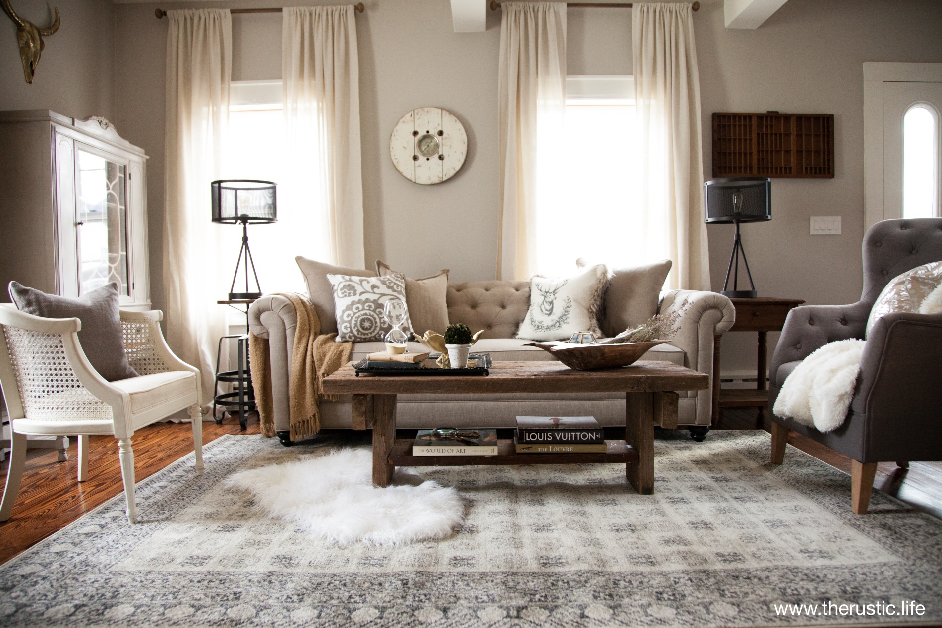
Today is the day! I’ve been waiting over a week to be able to share with you all our formal living room makeover. Once again, I’ve partnered up with one of my favorite furniture stores, Raymour and Flanigan to FINALLY design our formal living room. We have been in this house a little less than a year now, and we have made lots of updates and decorated most rooms, but the formal living room was the final space that needed some TLC. At first I was going to make it more casual and choose the Tatiana sofa considering that we live in a farmhouse built in 1871, but then I thought…that’s what the family room was for. So I hit the computer and came up with this inspiration board to help guide my vision. I have to say I’m very proud of this room. When decorating, I like to push myself to be the best I can be. This room far exceeded what I had envisioned once I pulled all the elements together. It’s a true vision come true where refined elegance meets rustic chic. PHOTOGRAPHY BY: LINDSAY STANFORD PHOTOGRAPHY


When I saw the Howell Sofa, I knew that was the one. The fabric is a poly/linen blend so I found it durable yet also comfortable and full of texture. I knew the tufted accent on the sofa would give the formal living room a more refined rustic feel to it. Perfectly me. Unfortunately, it’s not longer for sale, but the Harlow sofa is just as elegant if you are looking for a tufted sofa that is neutral in color. The table lamps I picked out are also from Raymour and Flanigan. They are called the Union Station lamps and can be found in the showroom, online however, they have a beautiful and wide variety of lamps to fit most any style. DESGIN TIP: Notice how the curtains are hung way above the window trim? Hanging your curtains that far above your windows, allows the eyes to travel up giving the illusion that your windows are grander/taller than they actually are. It’s a beautiful and timeless look. These curtains were 108″ long and allowed for a nice amount of puddling of the fabric on the floor.

That hutch…I was going to sell it after I made it over with this DIY project, but seeing it in this space, I’m so glad I didn’t! It fits perfectly. The brass skull above the hutch was found at Target.

When styling a coffee table, I personally think it should have interesting items on it since it is a focal point of a space. The brass leaf bowl I got from Pier 1. The bronze jax from Restoration Hardware and the hour glass I got from World Market.

The dough bowl was a vintage market find. The brass octagon I found at World Market and the birch branches and moss balls I picked up at Michael. I am all about texture and wanted to fill this bowl with lots of it.

I LOVE vintage distressed rugs and I knew the Pembroke Rug was the perfect choice for anchoring the space. The colors were softly muted and I love the simple look of the pattern. I didn’t want a busy patterned rug to take away from the other elements of the room and this did the job. The coffee table was made by the man of the house from a very long piece of barn wood we found in our garage.

The chair is from an antique store. I just LOVE the cane backing that surrounds it. It was located in the family room, but once the formal living room was done, I knew it had found its proper home.

The mirror I picked up from Restoration Hardware. The lantern candle holder in the corner nook I sell. The rustic shelf is a vintage find. It was an old shipping cart. Shelves were added to turn it into a more useful bookshelf.

The clock is from Home Goods.

That old newspaper print in the corner came with the house. It’s the front page of a newspaper from October 22nd 1916 (my birthday is October 22nd so we definitely thought this was a cool piece to hang int the room considering the vintage look and feel of it).

If you follow me on snap chat (under Sandra Downie) you would have seen the day, I picked up that vintage door. I didn’t know what I would do with it, but I knew I LOVED it. I try to only fill my home with things I love and I love this. I moved it around to several spots in our house, but once this room was done, I knew the door was perfectly sized to become art for that space it fills so nicely.
Thank you so much for coming along with me and seeing this room. Thank you Raymour and Flanigan for the partnership one again!
Interested in getting this look in your home? Shop This Look to see more of what Raymour and Flanigan has to offer.
Leave a Reply Cancel reply
Wherever you live, however you live, Sandra’s goal is to help you create spaces you want to come home to. Spaces that feel welcoming, effortless and ready for living.